Understanding the CSS Box Model
Posted on August 4, 2025 • 3 min read • 451 wordsThe box model is a fundamental concept in CSS. This article explains visually and simply how content, padding, borders, and margins work.
I. What is the CSS Box Model?
In CSS, every HTML element is treated as a rectangular box. This is called the box model.
The box model defines how an element’s total size is calculated, and how it interacts with surrounding elements.
An HTML element consists of 4 main areas:
+-------------------------------+
|         margin (outer)       |
|  +-------------------------+  |
|  |     border (border)     |  |
|  |  +-------------------+  |  |
|  |  |  padding (space)  |  |  |
|  |  | +---------------+ |  |  |
|  |  | |   content     | |  |  |
|  |  | +---------------+ |  |  |
|  |  +-------------------+  |  |
|  +-------------------------+  |
+-------------------------------+
II. The 4 Parts of the Box Model
1. content
The actual content of the element (text, image, button…).
2. padding
The inner space between the content and the border.
Example:
padding: 20px;Adds 20 pixels of space inside the element, around the content.
3. border
The border around the element. It can have a color, width, and style.
Example:
border: 2px solid black;4. margin
The outer space between the element and others around it.
Example:
margin: 10px;Adds 10 pixels of space between this box and its neighbors.
III. Calculating an Element’s Size
By default (with box-sizing: content-box), the total size of an element is:
total width = content + left/right padding + left/right border
total height = content + top/bottom padding + top/bottom border
⚠️ Margins are not included in the total element size.
IV. box-sizing: border-box (Best Practice)
Most developers prefer using:
* {
  box-sizing: border-box;
}
This includes padding and borders in the element’s total size, making layout easier to manage.
Practical Example:
.box {
  width: 200px;
  padding: 20px;
  border: 2px solid black;
  box-sizing: border-box;
}
In this case, the entire element will be 200px wide, not 200px + 2×20px + 2×2px.
V. Tips to Remember
- Padding pushes content inward.
- Margin pushes the element outward.
box-sizing: border-boxis more intuitive for sizing.- Use
outline:if you want a border that doesn’t affect layout size.
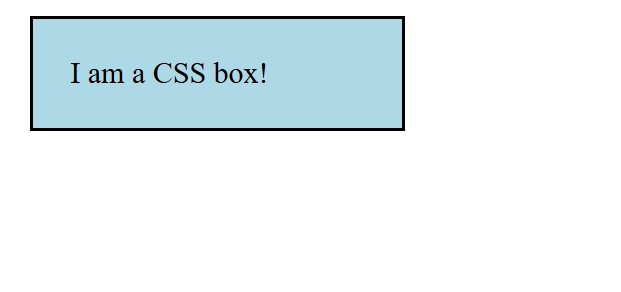
VI. Try it in the Browser
Here’s an HTML+CSS example to test:
<style>
  .box {
    width: 200px;
    padding: 20px;
    border: 2px solid black;
    margin: 10px;
    box-sizing: border-box;
    background-color: lightblue;
  }
</style>

<div class="box">
  I am a CSS box!
</div>
Useful online tools: JSFiddle – Create interactive HTML/CSS/JS demos
VII. 🔗 Useful Resources
VIII. Conclusion
Understanding the CSS box model is essential for mastering layout. By visualizing it as stacked layers (content → padding → border → margin), you’ll gain precise control over spacing, alignment, and how your HTML elements render.