CSS Color Palette: How to Choose and Combine Colors Effectively
Posted on September 16, 2025 • 5 min read • 985 wordsA structured guide for beginner and intermediate front-end developers to choose and combine a CSS color palette effectively.

I. Why a Well-Thought CSS Color Palette Matters
A well-designed palette ensures visual consistency, reinforces brand identity, and provides a smooth user experience. It simplifies code maintenance, avoids redundant colors, and allows for easy theme adaptation (light/dark). Following best practices also enhances accessibility: sufficient contrast, and visual cues beyond just color.
II. Understanding CSS Color Formats (hex, RGB, HSL, keywords)
CSS offers several formats to define colors:
- Keywords: simple and readable (
red,blue,fuchsia, etc.), with over 140 standard names. - Hexadecimal (
#FF0000, shorthand#F00): widely used, allows over 16 million colors. - RGB / RGBA: e.g.
rgb(255,0,0)orrgba(255,0,0,0.5), useful for opacity adjustments. - HSL / HSLA (CSS Color Level 4): great for generating tones based on hue, saturation, and lightness.
Using CSS variables (custom properties) helps centralize color definitions: branding vs functional.
III. Methods to Create and Organize a Cohesive Palette
1. Based on a Primary Brand Color
Convert a hex value to HSL and extract h/s/l components to generate variants (text, surfaces, shadows) using calc().
2. CSS Approach with Variables and Functions
Build a palette using:
--brand-hue,--brand-saturation,--brand-lightness- text colors (
--text-primary,--text-secondary), surfaces (--surface-1…--surface-4)
This ensures easier maintenance and visual coherence.
3. Naming Conventions
Separate branding names (blue-light, red-dark) from functional names (link-color, banner-bg) to avoid tying visual output to specific tones in code.
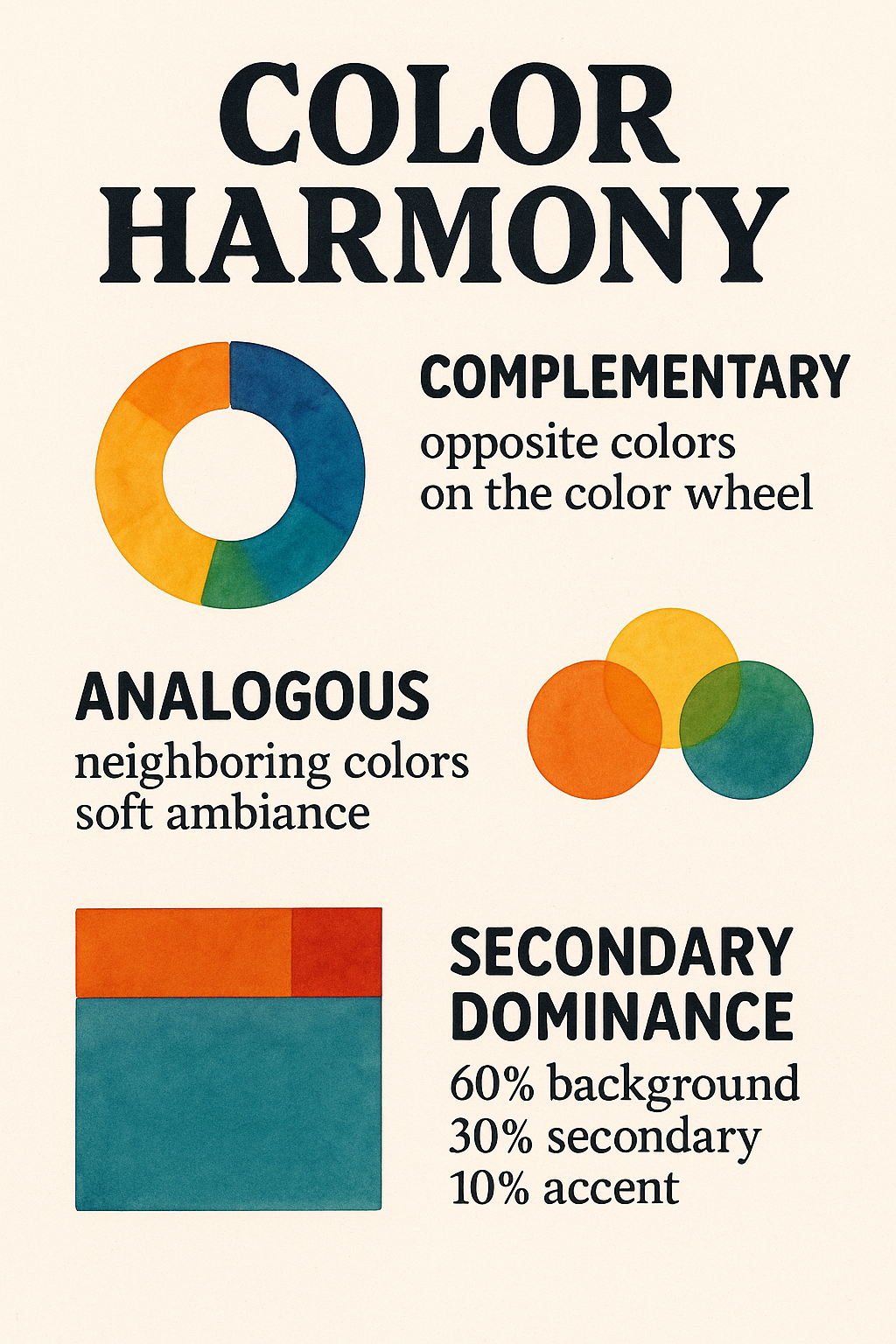
IV. Principles of Color Harmony and Accessibility
Common combinations from color theory:
- Complementary (opposite on the color wheel)
- Analogous (neighboring colors, soft ambiance)
- Secondary dominance (60‑30‑10 rule): 60% background, 30% secondary, 10% accent
WCAG Accessibility:
- Never use color as the only means of conveying information.
- Maintain sufficient contrast, especially for text and buttons.
Dark Mode Support:
- CSS
color-scheme: light dark;for user theme compatibility. - Media query
prefers-color-schemeto dynamically adapt color themes.
V. Use Case and Comparison Table: Light vs Dark Theme
Use Case: Comparison Table
| UI Element | Light Theme | Dark Theme |
|---|---|---|
| Base Color | --brand-light: hsl(200,100%,50%) | --brand-dark: same hue, but 20% lower lightness |
| Primary Text | --text1-light: hsl(200,100%,10%) | --text1-dark: hsl(200,30%,90%) |
| Surface | --surface1-light: hsl(200,10%,99%) | --surface1-dark: hsl(200,10%,10%) |
| Accent / hover | --surface2-light: 92% lightness | --surface2-dark: 20% lightness |
| Contrast | Very high for readability | Bright text on dark background |
CSS Variable Example:
:root {
  --brand-hue: 200;
  --brand-sat: 100%;
  --brand-light: 50%;
  --text1-light: hsl(var(--brand-hue), var(--brand-sat), 10%);
  --surface1-light: hsl(var(--brand-hue), 10%, 99%);
  --text1-dark: hsl(var(--brand-hue), 30%, 90%);
  --surface1-dark: hsl(var(--brand-hue), 10%, 10%);
}
:root { color-scheme: light dark; }
@media (prefers-color-scheme: dark) {
  body {
    color: var(--text1-dark);
    background: var(--surface1-dark);
  }
}
VI. 🔧 Useful Tools to Build and Test Your Palettes
Creating a relevant color palette requires more than design sense. Accessibility, contrast, visual consistency, and cross-device compatibility are key aspects. Fortunately, modern tools can help you master them. Here’s a comprehensive comparison of three essential tools: ColorBrewer, Coolors, and Adobe Color.
A. ColorBrewer – For Robust and Accessible Palettes
Originally designed for cartographers and data scientists, ColorBrewer offers palettes tested for visual clarity, high contrast, and color blindness compatibility (blind, print, LCD, or photocopy friendly).
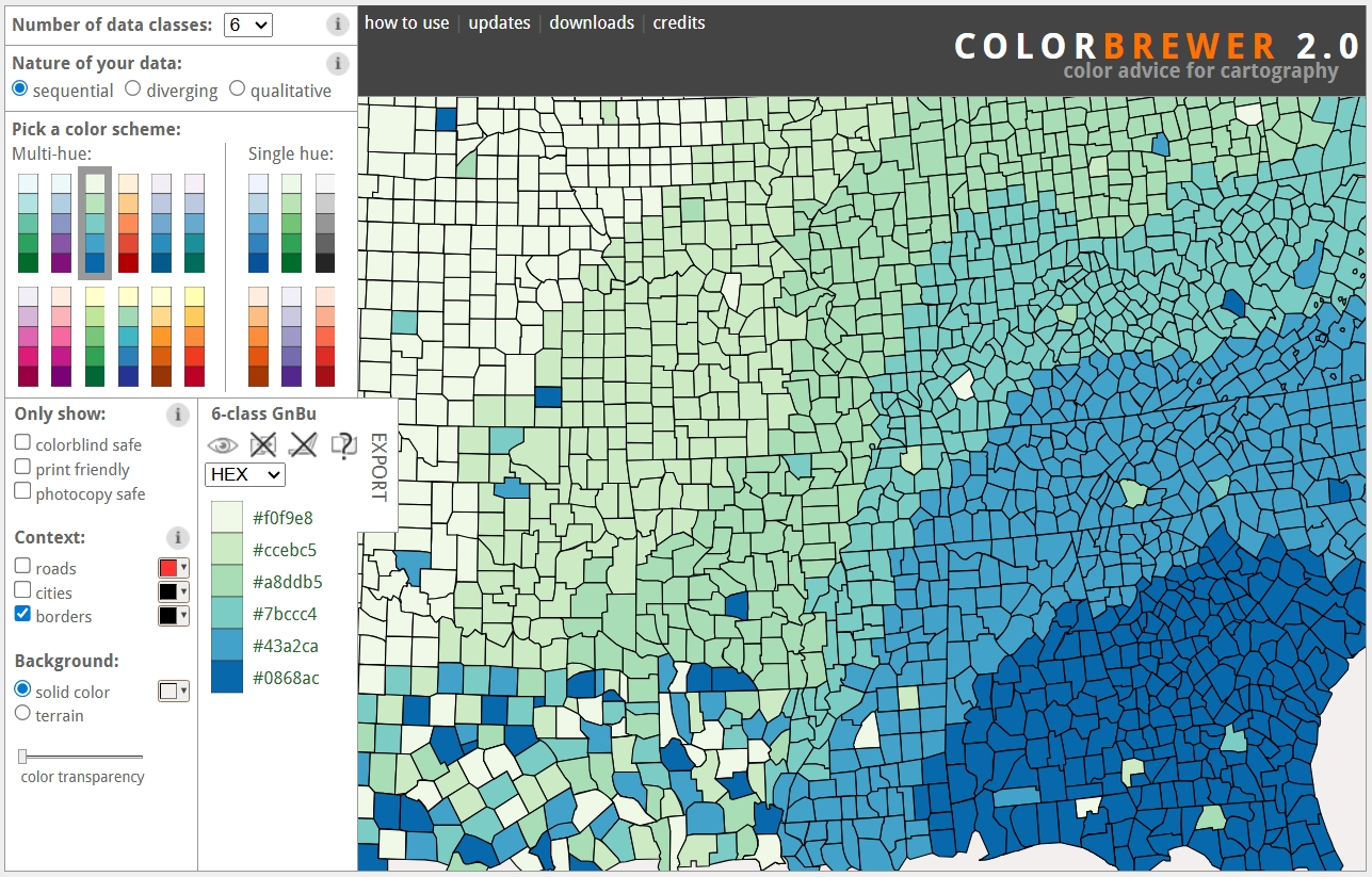
Key features:
- Choose a palette type based on data:
- Sequential for continuous values (e.g., temperatures),
- Diverging for centered data (e.g., gains/losses),
- Qualitative for distinct categories (e.g., regions).
- Visibility tests for various types of visual deficiencies.
- Previews on different backgrounds (light, dark, map).
- Export in HEX, RGB, CMYK.
- Free for both personal and commercial use.
Strengths:
- Built for accessibility.
- Ideal for data-heavy visualizations.
- Simple and effective for focused needs.
B. Coolors – The All-Purpose Tool for Creatives
Coolors is a fast and modern palette generator, loved by UI designers, frontend developers, and content creators. It’s perfect for experimenting and building harmonious color schemes on the fly.
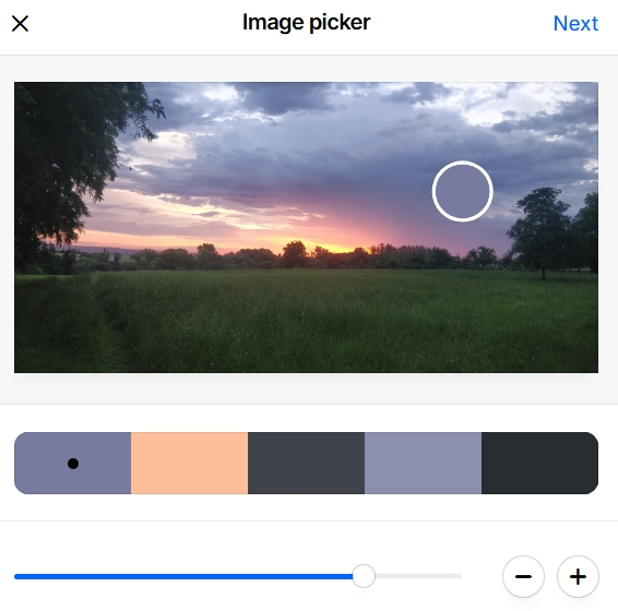
Key features:
- Random palette generation (space bar), with the ability to lock specific colors.
- Fine-tune colors manually (HEX, HSL, CMYK, Pantone).
- Image import to extract dominant tones — moving the image changes the palette.
- Create:
- Gradients,
- Shades & tints,
- Simulated layouts to test colors on components (buttons, text, background).
- WCAG contrast testing built-in.
- Export options: CSS, SVG, PNG, PDF, JSON, CSS variables.
 Quick creation and visualization of a palette with image/text preview. The tutorial is short and effective.
Strengths:
- Ultra-fast and intuitive.
- Great for fast-paced or team workflows.
- Lets you test directly in UI/UX context.
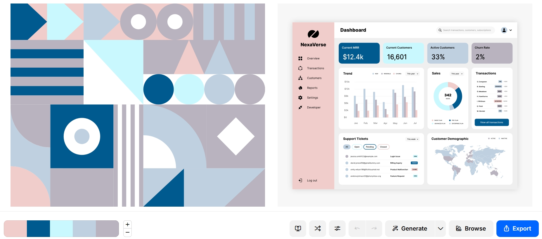
C. Adobe Color – For Advanced Color Harmony
Adobe Color is a comprehensive tool to build palettes based on color theory, with professional-level precision. It’s integrated with the Adobe Creative Cloud suite, especially Photoshop, Illustrator, XD, and After Effects.
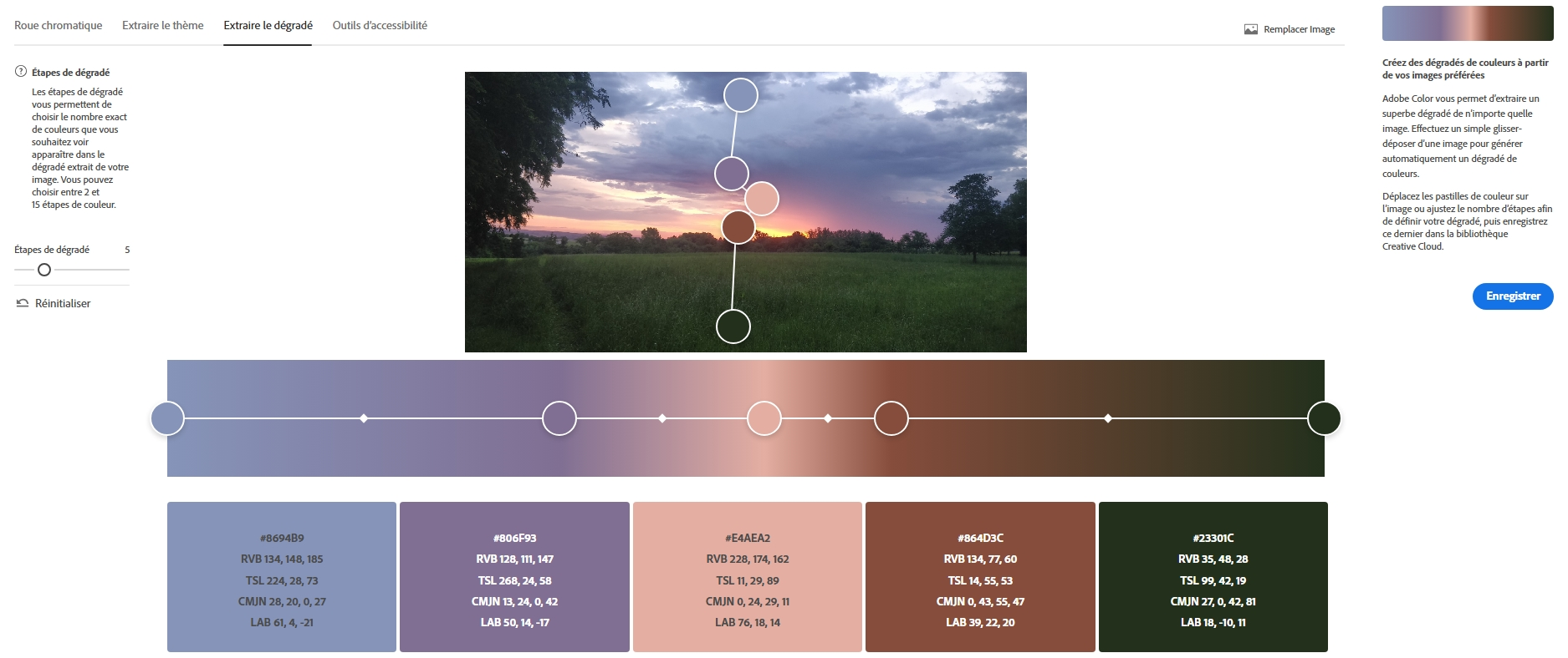 Access to a color wheel, extract themes or gradients from images, and use contrast-checking tools.
Key features:
- Choose from harmony rules:
- Complementary
- Analogous
- Triadic
- Monochromatic
- Compound
- Real-time rendering on an interactive color wheel.
- Extract palettes from uploaded images.
- Analyze for WCAG accessibility (contrast, readability).
- Supports: HEX, RGB, LAB, CMYK, HSB.
- Community trend feature: explore or reuse popular palettes.
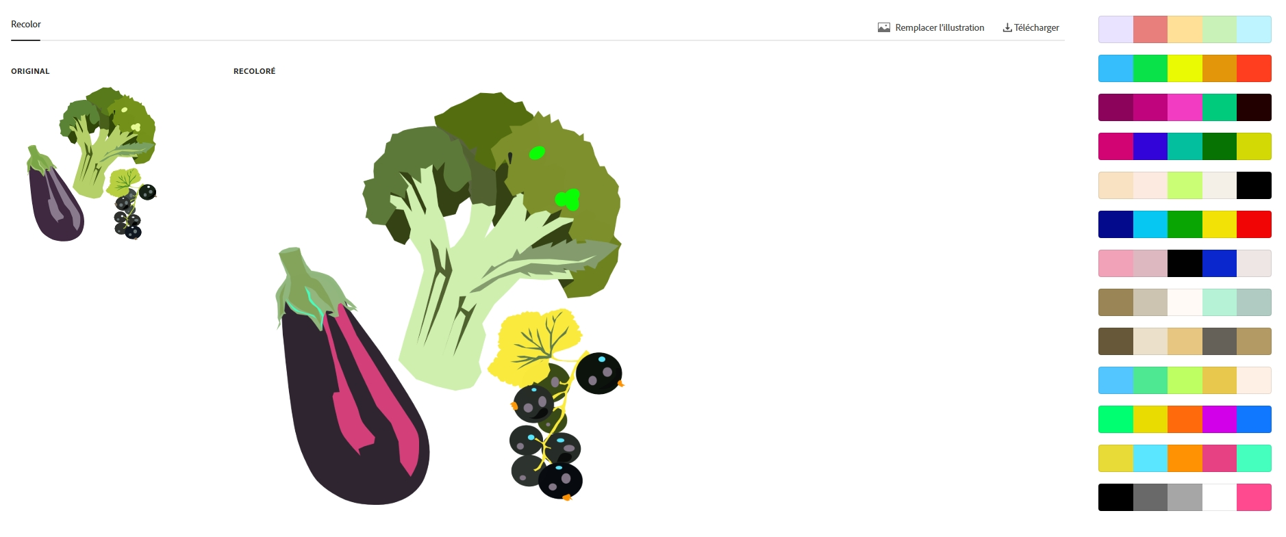
- Try recoloring SVG images directly.
Strengths:
- Extremely precise and powerful.
- Best for branded projects requiring tight visual control.
- Seamless integration with Adobe creative tools.
🧾 Summary Comparison
| Tool | Recommended Use Case | Key Strengths |
|---|---|---|
| ColorBrewer | Data visualization, maps, accessibility | Simplicity, readability, color blindness compatibility |
| Coolors | UI design, quick prototyping, creative flow | Fast, visual, preview in components, flexible export |
| Adobe Color | Branding, UX design, Adobe suite integration | Color theory, image extraction, professional ecosystem |
💡 Tip
Each of these tools serves different needs. You can combine them in your workflow:
- Start with Coolors for inspiration,
- Check accessibility with ColorBrewer,
- Finalize in Adobe Color for precision and implementation.
VII. Conclusion
Choosing and organizing a CSS color palette is more than aesthetics: it’s a foundation for consistency, accessibility, and long-term maintainability. With modern CSS capabilities, good design practices, and systematic use of variables, even beginner developers can build professional, flexible themes. By designing with accessibility and theme consistency in mind, every user gets a pleasant and inclusive experience.