Responsive vs Adaptive: Two Strategies, One Common Goal
Posted on July 28, 2025 • 4 min read • 679 wordsUnderstand the core differences between responsive and adaptive design, and learn when to use each approach.
I. Introduction
Responsive design and adaptive design are two widely used approaches to creating web interfaces that are accessible across a variety of devices. In a world where screen size diversity — from smartphones to 4K monitors — is the norm, understanding the differences between these strategies is essential for any frontend developer or designer. This article offers a clear, comparative, and well-documented overview of both methodologies, including concrete use cases and practical recommendations.
II. Definitions and Core Concepts
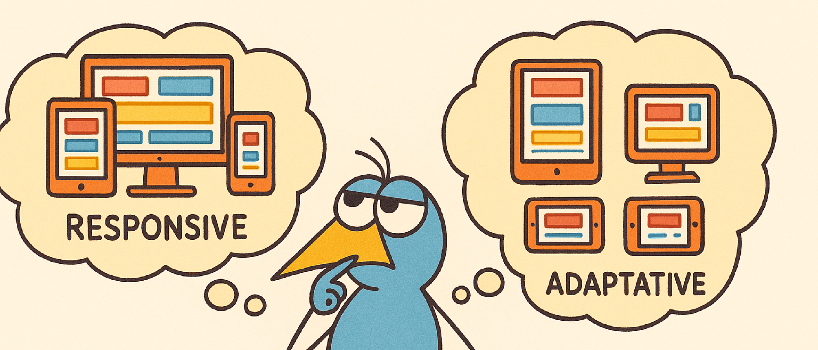
Responsive Design
Responsive design is based on fluid grids, CSS breakpoints (typically using media queries), and elements that dynamically adapt to the screen width.
- Example: a web page with a single column on desktop transforms into stacked blocks on mobile.
- Technologies used: HTML5, CSS3, flexbox, grid, media queries.
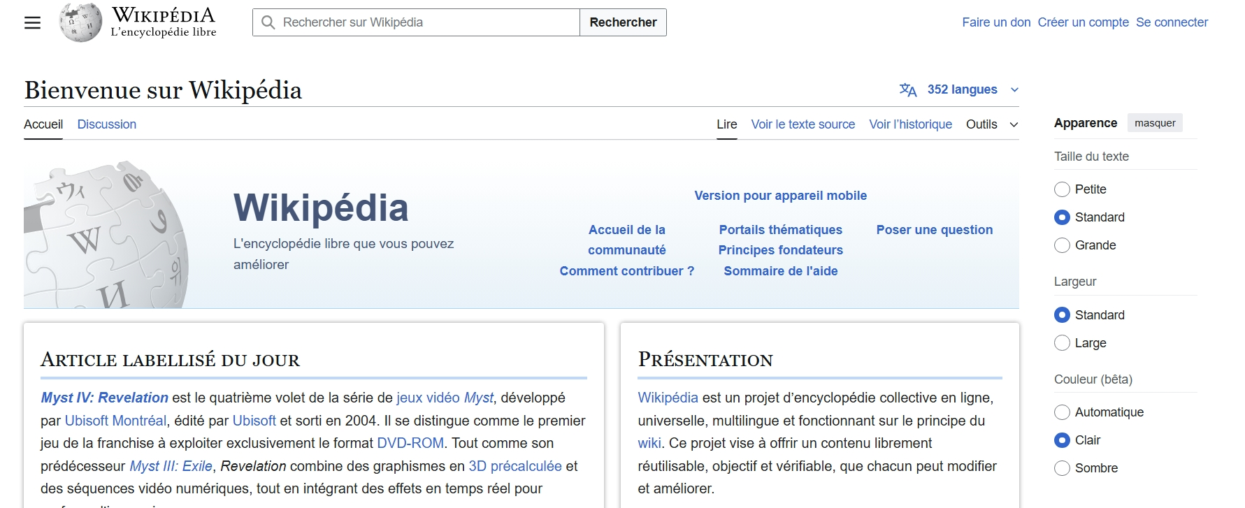
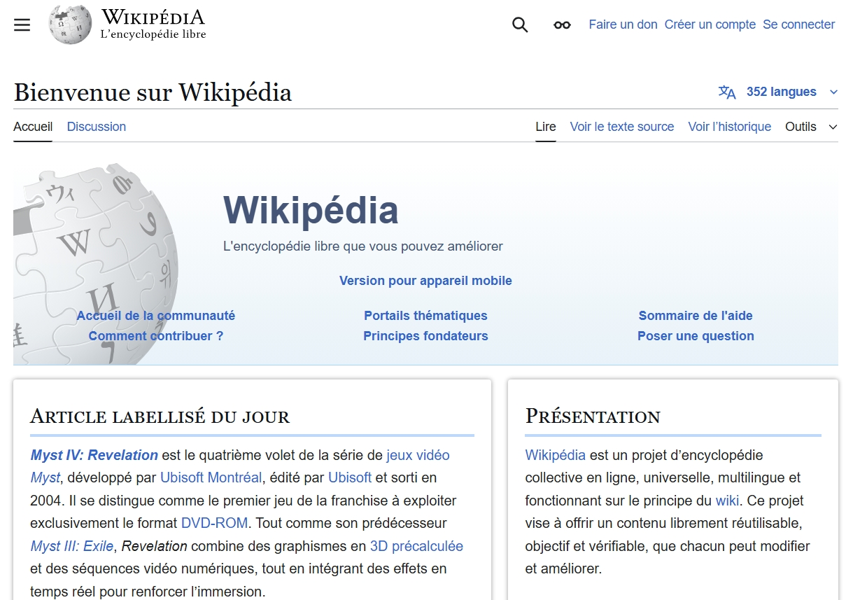
💡 Real-world example: Wikipedia is a great example of responsive design. When resizing the browser window, the sidebar disappears, content reflows automatically, and text remains readable without distortion. There’s no redirection, and the layout adapts fluidly.
 Screen size: large
 Screen size: medium
 Screen size: small
Adaptive Design
Adaptive design uses a set of fixed layouts, each designed for a specific screen size. The server or browser selects the most appropriate layout based on the device.
- Example: an application may serve a 1024px layout for tablets and a 320px layout for smartphones.
- Technologies used: client-side detection (JavaScript) or server-side detection (user-agent), conditional CSS styles.
💡 Real-world example: Apple primarily uses an adaptive approach. When accessing the site from an iPhone, a dedicated layout loads with a tailored hamburger menu and resized images compared to the desktop version. It’s not just fluid resizing, but a design explicitly built for the target device.
Key difference: Responsive is fluid (continuous adjustment), while adaptive is discrete (breakpoint-based shifts).
III. Detailed Comparison: Responsive vs Adaptive
| Criteria | Responsive Design | Adaptive Design |
|---|---|---|
| Flexibility | Highly flexible | Limited to predefined sizes |
| Maintenance | Fewer files, simpler | Multiple versions to maintain |
| Performance | Single layout loads | Can optimize per-device loading |
| UX | More fluid, sometimes less precise | More controlled experience per device |
| Implementation | Faster to implement | Technically more complex |
| Resizing Behavior | Dynamic | Static |
IV. Use Cases and Recommendations
When to Favor Responsive?
- Public-facing websites meant to be accessible on any device.
- Blogs, e-commerce, content pages, SaaS products.
- Projects with limited resources or small teams.
Example: A news site like Le Monde uses a responsive layout. The content grid reorganizes depending on screen size, images resize automatically, and columns stack vertically on mobile.
When to Use Adaptive?
- Complex applications requiring tailored UX per device (e.g., internal tools).
- When performance or loading time is critical.
- In environments with high frontend customization.
Example: Amazon Kindle Cloud Reader is a typical adaptive interface. It delivers entirely different experiences on mobile and desktop, using dedicated components instead of just resized versions.

Combining Both
It’s common to blend adaptive elements into a responsive base to address specific needs:
- Device detection to serve platform-specific components (e.g., native menu on mobile).
- Conditional loading of images or scripts depending on the platform.
V. Best Practices for Each Approach
For Responsive Design:
- Use relative units (
em,%,vh,vw) instead of pixels. - Define breakpoints based on real usage patterns, not just device sizes.
- Test across a wide range of real screen sizes, not just emulators.
For Adaptive Design:
- Favor a modular architecture, with separate files for each layout.
- Implement reliable device detection.
- Optimize asset sizes per layout: compressed images, minimal JavaScript.
Useful Tools:
- Responsive: Tailwind CSS, Bootstrap, Figma responsive layout, Chrome DevTools.
- Adaptive: JavaScript
matchMedia,navigator.userAgent, server-side frameworks (Next.js, Symfony).
VI. 🔗 Useful Resources
- MDN - Responsive design
- Google Developers - Responsive vs Adaptive
- Smashing Magazine - Adaptive Web Design
VII. Conclusion
Choosing between responsive and adaptive design isn’t about aesthetics—it’s about functional needs, target user experience, and available resources. Responsive design has become the default for most modern projects due to its flexibility. Still, adaptive design remains crucial in performance-critical or highly customized environments. Mastering both allows developers to build interfaces that are robust, scalable, and optimized for every user.